Reflections on social media: The tyranny of Instagram’s grid.
grids
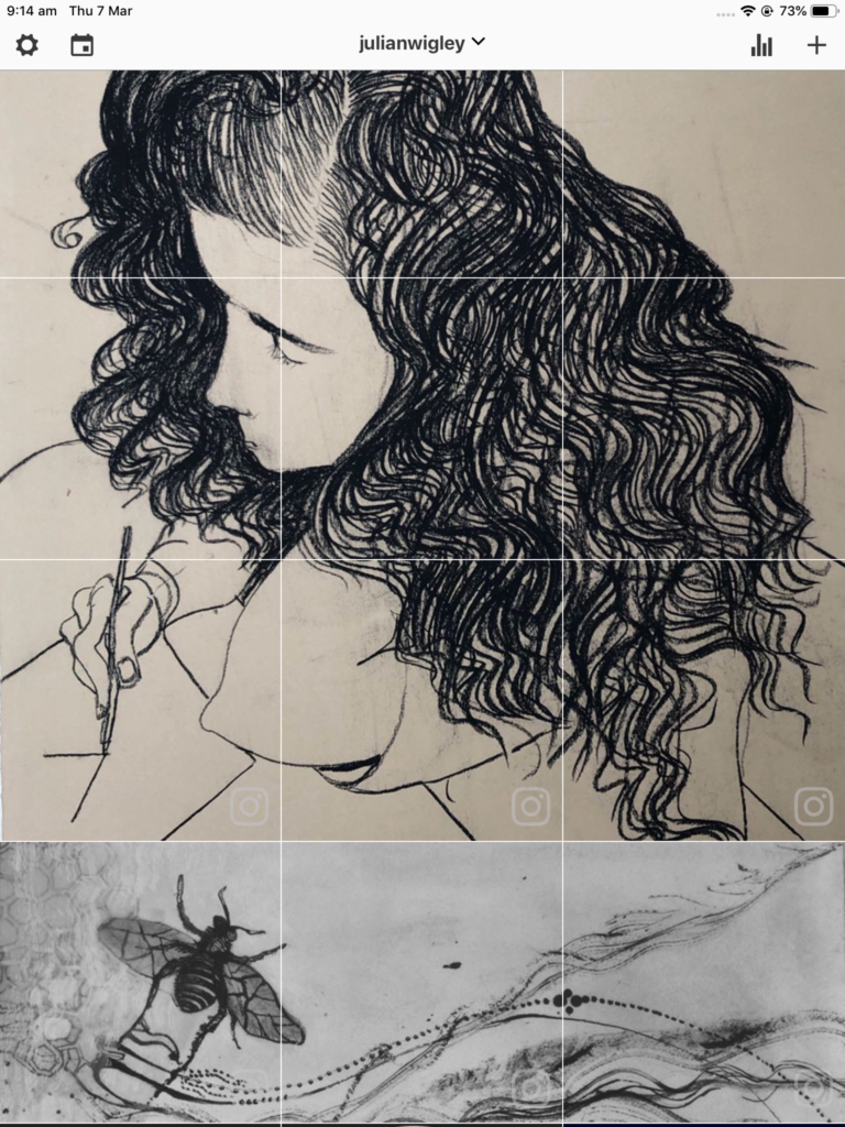
I am treating the use of the grid as a game and enjoying it. The purposes of placing multiple grid posts is to create mystery and anticipation of the evolving image. It also enables the showing of larger images within the Instagram grid profile ( if the image is not too degraded in the process). Not all segments can hold the eye when posted into public feeds as orphans. It is not always possible to select an image where each segment can standalone. It may work a couple of times but likely to become annoying to viewers over time.
An interesting approach is to map the dominant design lines at the boundaries between a selection of unrelated images to creat visual continuity. This breaks the tyranny of the grid and demands creative input to help maintain interest in making the profile feed. Another approach is to tell a sequential story across selected squares.
It will take time which ever way is chosen. So, in the end, it is to know what you want out of making your feed. …he mumbles to himself.

Top
Noonkanbah teacher 1983- Charcoal pencil drawing on coloured paper (556m x 760mm).
Bottom
Insect trails. Mixed media.

